InDesign: Business Card
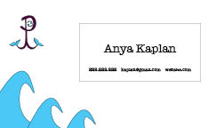
For the Business Card project, it was a little challenging to use Adobe InDesign for the first time. It took a bit of time to figure out the process of creating the card, but I eventually got the hang of it. The first thing I had to do was set up the layout of the cards, making them realistically configured business cards. Next, I had to brainstorm my three designs, so that they could correlate with my previously created logos.
My first business card used the burgundy and sky blue colored logo. I decided to create an ocean-themed card first that included an anchor or the front of the card, and a wave design on the bottom left of the back of the card. To create the anchor, I used the pen tool to create the shapes of the bottom of the anchor, and the ellipse shape and line tool. I used the pen tool to create the waves in the corner of the back of the card.
For my second business card, I had to think of a design that would match the dark blue and purple logo. Instead of placing the logo in the square rectangle like the previous card, I placed it in the ellipse and added a thin stroke. Additionally, I used the pen tool to create the curve designs on the corners of both sides of the cards.
For my last business card, I used a watermelon pink, green, and darker pink color palette as my theme. On the logo on the front of the card, I used the object effect to create a drop shadow. The back of the card has three pen tool-created designs layered in the bottom left corner. I simply incorporated the logo on the back of the card in the top right corner and filled the color of the box with the same watermelon pink.


Dear, Anya
ReplyDeleteI really like what you did with this project. The back and the front of each card go really well together, I like how its organized. I also like the theme of colors you went for. Finally my favorite part is how you added shadows to the last card, it looks very nice.
Hi Anya, great job on all three of your business cards. My favorite one is the last one because I like how you incorporated the shadow. I love that all three follow the same theme and tie together with your logo, while at the same time they all speak in different ways.
ReplyDeleteThese business cards you made are amazing! I really like the choice of the baby blue and baby pink colors. The waves you created with the pen tool are really well done and the shadows on the pink cards are perfect. Great job!
ReplyDeleteHey Anya, I really like these business cards, they are simple and complicated at the same time. I find them very creative and professional. Good job!
ReplyDelete