Posts

Final Portfolio

  On the first day of class, when we covered an introduction to coding, I was quite overwhelmed. I honestly was a bit concerned, as I thought to myself, “This isn’t what I signed up for”. The following few classes changed my mind, and I became excited and interested in what we were learning and creating. Being my first time in a digital media class, I was quite challenged by the programs we were expected to use. However, I shortly realized that once you start using the programs and playing around with them, you can catch on quickly. Throughout each project and assignment, I found it quite satisfying being able to complete the task, and do something creative that I have never done before! Creating this Final Portfolio was quite exciting! It was very cool to be able to go back through all of my works from the beginning of the semester to see how much I have improved. 
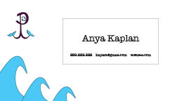
InDesign: Business Card

Image
  For the Business Card project, it was a little challenging to use Adobe InDesign for the first time. It took a bit of time to figure out the process of creating the card, but I eventually got the hang of it. The first thing I had to do was set up the layout of the cards, making them realistically configured business cards. Next, I had to brainstorm my three designs, so that they could correlate with my previously created logos.  My first business card used the burgundy and sky blue colored logo. I decided to create an ocean-themed card first that included an anchor or the front of the card, and a wave design on the bottom left of the back of the card. To create the anchor, I used the pen tool to create the shapes of the bottom of the anchor, and the ellipse shape and line tool. I used the pen tool to create the waves in the corner of the back of the card.  For my second business card, I had to think of a design that would match the dark blue and purple logo. Instead of placing the lo

Indesign: Homework 1

 1. https://www.youtube.com/watch?v=RXRT3dHu6_o The first tutorial that I came across for InDesign in Adobe was "InDesign for Beginners | FREE COURSE" by Envato Tutorials. I think this tutorial is really good because it does not only have almost 2 million views, suggesting it is quite reliable, but also the account is verified. When looking for tutorials in adobe, I find that these two factors are important, as they determine if the video is credible, and is made by someone who actually knows what they are doing. Additionally, I like this tutorial because it is very lengthy, and contains a lot of good information and skill explanations. It contains several sections (by timestamp) that include creating and using color, adding and manipulating text, image resolution, and many other helpful skills.  2. https://www.youtube.com/watch?v=0eqhUFRlvgI The second video I found about InDesign in Adobe was "Learn Adobe InDesign in 9 MINUTES! | Formatting, Tools, Layout, Text Etc. |

Autoscopy

Image
  For my Autoscopy project, I was inspired by nightmares. Autoscopy, an experience where someone perceives their surrounding environment in a different perspective, inspired me to think about an experience in my dreams, where everything is completely altered. This idea of an altered perspective and reality immediately led me to think about nightmares. For me, when I recall my nightmares, the images of the devil or skeletons, and dark demon smoke comes to mind. I wanted to incorporate those images in altering my self-portrait. I began with a simple selfie of mine and then used adobe photoshop to layer images and alter the hues of the original to create an eery image. In order to make my self-portrait fit into a nightmare, I selected 4 other images from the internet that I could layer.  Using adobe photoshop, I place embedded the bottom left smoky dark image as a background. Then I place embedded the self-portrait of myself on top of the smoky background. To make the image of myself matc

Pixels: Somewhere

Image
  For this project, I was inspired by the environment and setting from the movie Avatar. I wanted to replicate the woman in the image on the left. I used photoshop to trasnport an image of myself into that setting. Using the adobe photoshop for this project was quite tricky for me at first. I had to watch and find several tutorials that would help explain the process. I first embedded the original image of myself onto a new file. I used the lasso tool and selected and masked the image. Before doing this, and in order to use the onion mask, I created a bright green layer. This served as a green screen. I used the selection tool and the polygon tool holding the option key, to select the part of the original image I would transport into the Avatar. I selected just by body, and carefully zoomed and edited to make sure it was as clean as possible. I then had to take some steps to prepare the selected portion to be copy and pasted (inverted, control delete, select as new mask and layer, etc)

Pixels Homework 3

Image
  1. I think that it would be quite difficult for me to photoshop myself into this image. Because the two people seem to be submerged in water and bubbles, it would pose a challenge of trying to make myself also look naturally placed in the image.  2. I chose the image above as inspiration for the Somewhere project because it is so unrealistic! The directions for the projection instruct us to pick somewhere we have neever been before, and I think this magical cloud environment would be so cool to place myself in. 3. I thought this photoshopped image was particularly funny, as the artist went to such wrong, and uncessary, humurous lengths to alter the image to what the post was asking. Just like the other images, the artist photoshopped the image in the completely wrong way, but still managed to do and accomplish what the request was! 4. I found this photo really cool, realistic, and beauitful. However, it is evident in the bottom image that it wasn't even real. This is really inspi

Pixels: BW to Color

Image
  For this Pixels project, I used Adobe Photoshop to transform a BW image of myself into these three different color combination images above. I began with a colored image of myself, and changed the mode of the image to greyscale. After picking my color sequences for each image, I changed the mode back to RGB color. For the first image, I used the square rule from color adobe. For the second image, I used the compound rule, and lastly the analogous rule. Altering these images from BW back to color was very time-consuming. With the complex tree in the background of the image, I had to carefully color each leaf and the sky poking out from behind. In fact, each image took me about 2 hours! I used the color dropper tool and the paintbrush tool, to transform the image into colorful renditions.